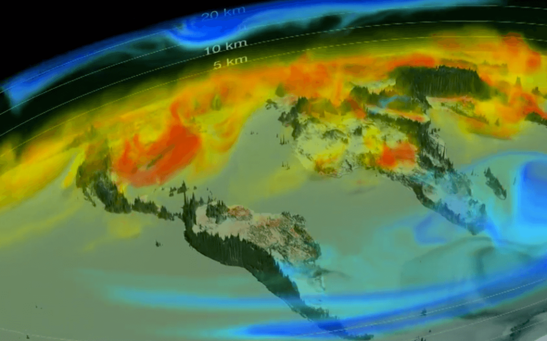
NASA has produced a new visualization that gives a real insight into where the real drivers of climate change lie and how carbon dioxide is abundant in the atmosphere. On the image, carbon dioxide is shown as winds of yellow, red, and blue that sweep across the globe. Yellow represents an average concentration level of carbon dioxide in the atmosphere, whereas red represents the highest and blue the lowest.
Much of the world’s increased levels of carbon dioxide come from the burning of fossil fuels with levels that fluctuate seasonally. NASA created the visualization using a supercomputer that used atmospheric measurements taken from the Orbiting Carbon Observatory-2 satellite (OCO-2). This satellite is one that’s responsible for capturing more than 100,000 carbon dioxide estimates every day from all across the globe.
The visualization also shows how carbon dioxide accumulates in the Northern Hemisphere during autumn and winter, and less in spring and summer. This is because, in the autumn and winter, trees shed their leaves and thus our carbon dioxide absorbing tools disappear. Then the opposite will occur, and when the leaves begin to grow again in the spring and summer, carbon dioxide levels decrease as the plants are now absorbing it all.
In the visualization, you can clearly see thick red and orange fog spread across half the world while the greenhouse gasses change from yellow to blue when photosynthesis occurs. The trouble is that not all the carbon dioxide gets sucked up by the new plants and hence the continuation of global warming.
More News To Read
- The UK Sets a Good Example with Green Energy Production Efforts
- Are Jellyfish the Answer to the World’s Energy Dilemma?
- Breakthrough Comes as Physicists Observed the Light Spectrum of Antimatter for First Time Ever
- So What’s the Story With the Faraday Future Flop?
- Renewables Set to Become Cheapest and Most Efficient Way to Power Our Homes


